Boris Soliz
UI Designer


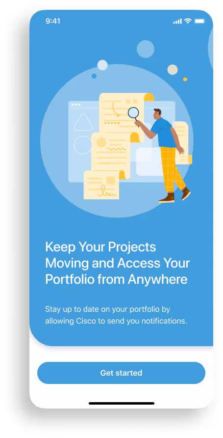
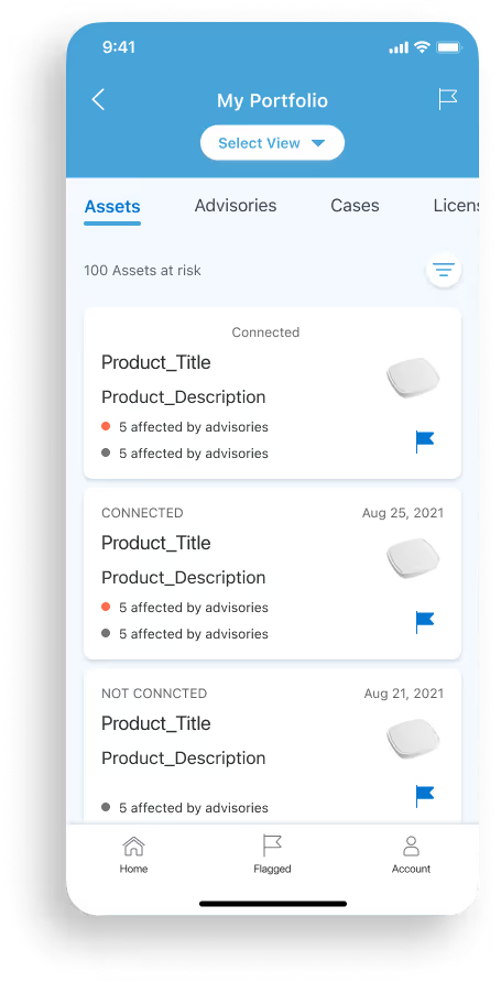
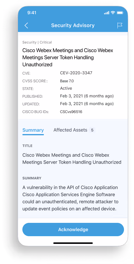
CX Cloud is a customer account web portal that allows customers to view, take action and gain helpful insights into every Cisco product they own from an account level. However, based on some research and customer need, there was a huge need for a mobile version of the app.

This insight underscored the need for a mobile CX Cloud app.

“I don't have the components I need for mobile because all components that exist today are for desktop only. I need mobile ready components and patterns to complete my design tasks and stay on brand.”

“I don't have the components specs or documentation that I can quickly use so I can develop my code. All information I have is for desktop only. I will need to manually create mobile code for my tasks to be complete. This increases time and tech debt.“
Without a mobile design system, Cisco’s CX Cloud faced fragmented user experiences, inconsistent branding, and inefficient development, ultimately slowing mobile adoption and scalability.
I approach this strategically and in close collaboration with many teams.
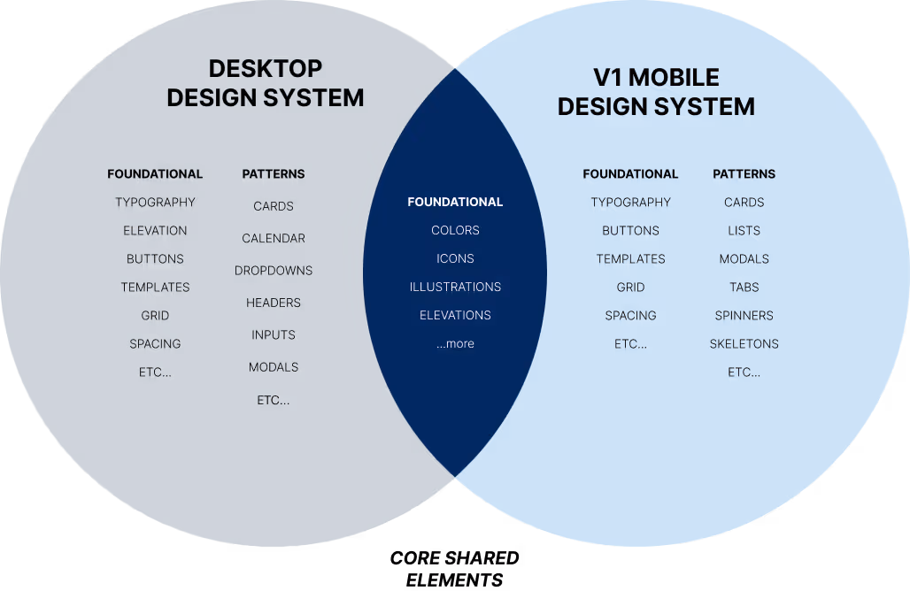
Through research, it became evident that we needed to stay close to our brand. Using the same core foundational elements for both systems was collectively agreed upon as the ideal approach. This ensured that the new system remained a sibling of the main design system rather than a distant relative, retaining a strong visual connection and coherence within the brand.
As the design system was just beginning to take shape, we started designing early screens to test and build upon the foundation.
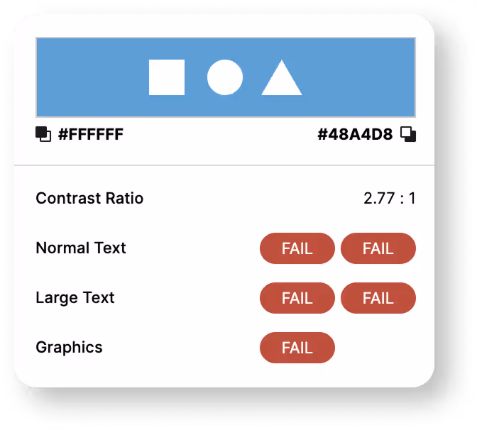
I uncovered that CX Cloud’s primary brand color was failing accessibility contrast standards, a critical issue that risked usability and compliance. This had to be fixed in order to continue developing the mobile design system.

With the designers equipped and operating using components within version 1 of the Mobile Design System, the focus shifted towards addressing the second challenge. This marked the beginning of our version 2 design system.

It became apparent that there was a deficiency in documentation and specifications for our components, indicating a need to address this aspect to better support developers in utilizing and implementing the design system. Aligning ourselves to the existing Desktop Design System will help various teams in these various methods.

Through dedicated teamwork and collaboration across various departments, including the visual design team, development team, multiple mobile designers, and leadership, we successfully created a second version of the Mobile Design System.

Additionally, we aimed to introduce an extra layer of surprise or enhancement to further elevate the system.
During the creation of documentation for our mobile design system, the team sought to introduce motion elements to enhance the system's appeal. However, a lack of motion guidelines for both mobile and desktop apps was noted. Consequently, a dedicated team, termed the "Tiger Motion Team," which I was a part of, was formed. This team's objective was to outline the desired goals for motion integration, ensuring alignment with our design principles and considering any necessary adjustments to these principles. After multiple design sessions, we distilled our motion principles to the following four:

Our customers are knowledgeable and don’t need us to explain every detail of our products and services. Motion should be unobtrusive, concise, & exist for a reason.

Our users are both busy and task-focused, therefore the animations should be limited to the task at hand. Motion should be selective and targeted.

Since our users are task-oriented, motion does not demand attention, but rather reinforces our user's goals and decisions with succinct and satisfying feedback.

Motion responds to customer inputs, and is choreographed and feels graceful. Our motion acts and responds as we expect them to in the real world. It just makes sense by giving our brand personality.
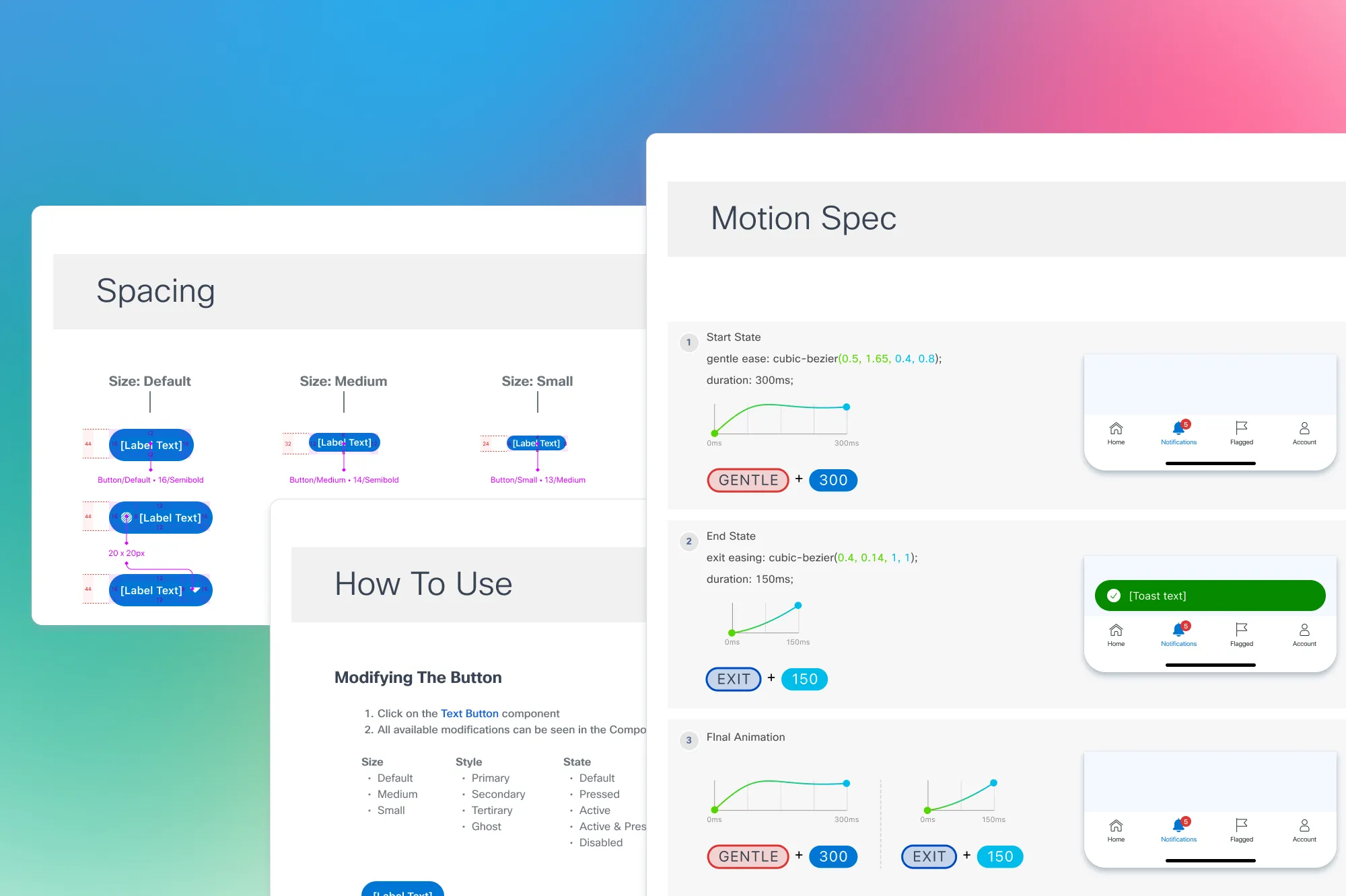
In exploring how motion could improve the app experience, I looked beyond simple delight and developed motion guidelines that evolved into a system-wide standard for both mobile and desktop. I aligned these guidelines with our design principles and refined details like timing, easing, and overall interactions to suit each platform. Let’s start with easing.
Easing
Recognizing the distinction between ‘Ease In’ and ‘Ease Out.’ I devised a new naming system for clarity in usage. Additionally, I introduced a standard and gentle bounce curve to infuse delight into various app situations. The timing aspects were informed by research and best practices observed in the industry's leading companies.
Color coding
To enhance comprehension, I color-coded the bezier curves (x1,y1,x2,y2), aiding both designers and developers in understanding the x and y coordinates. This approach proved valuable when creating specifications for developers. The developers, who would utilize this design system, appreciated the effort taken to clarify the motion specifications, acknowledging the benefit it brought to their work.

No Easing

Eases In

Eases Out

Eases In and out

Gentle Bounce
Timing and Duration
To keep motion consistent across mobile and desktop, I researched best practices for timing and duration, drawing from multiple sources. The result was a unified motion scale that aligned with our design principles and ensured smooth, consistent interactions across platforms.


This approach aided the team in comprehending the appropriate use of specific easings and timings for various UI elements. Here are some examples of the timing and duration in practical application.


Our work in detailing, designing, testing, prototyping, and animating added significant motion enhancements to the design system. The goal was to give developers a clear understanding of the design intent and how it should be implemented in code. Using tools like Aninix and Figma, we integrated motion specs directly into the documentation, providing component-level guidance and creating delightful, consistent interactions.

The Mobile Design System established a scalable foundation that transformed how Cisco approaches mobile design and development.
Components created
Screens designed for MVP
Faster developer handoff
Unified motion system

This project not only delivered Cisco’s first mobile design system, but also proved the value of a scalable approach—laying the groundwork for long-term adoption across teams.

Boris was a key member of our mobile design team as we built out the CX Cloud mobile app. He was very well liked by his coworkers, and contributed a balanced, calm, and confident vibe to our team. His key contributions were leading the mobile version of our design system, motion design guidelines, visual design, and marketing materials.

