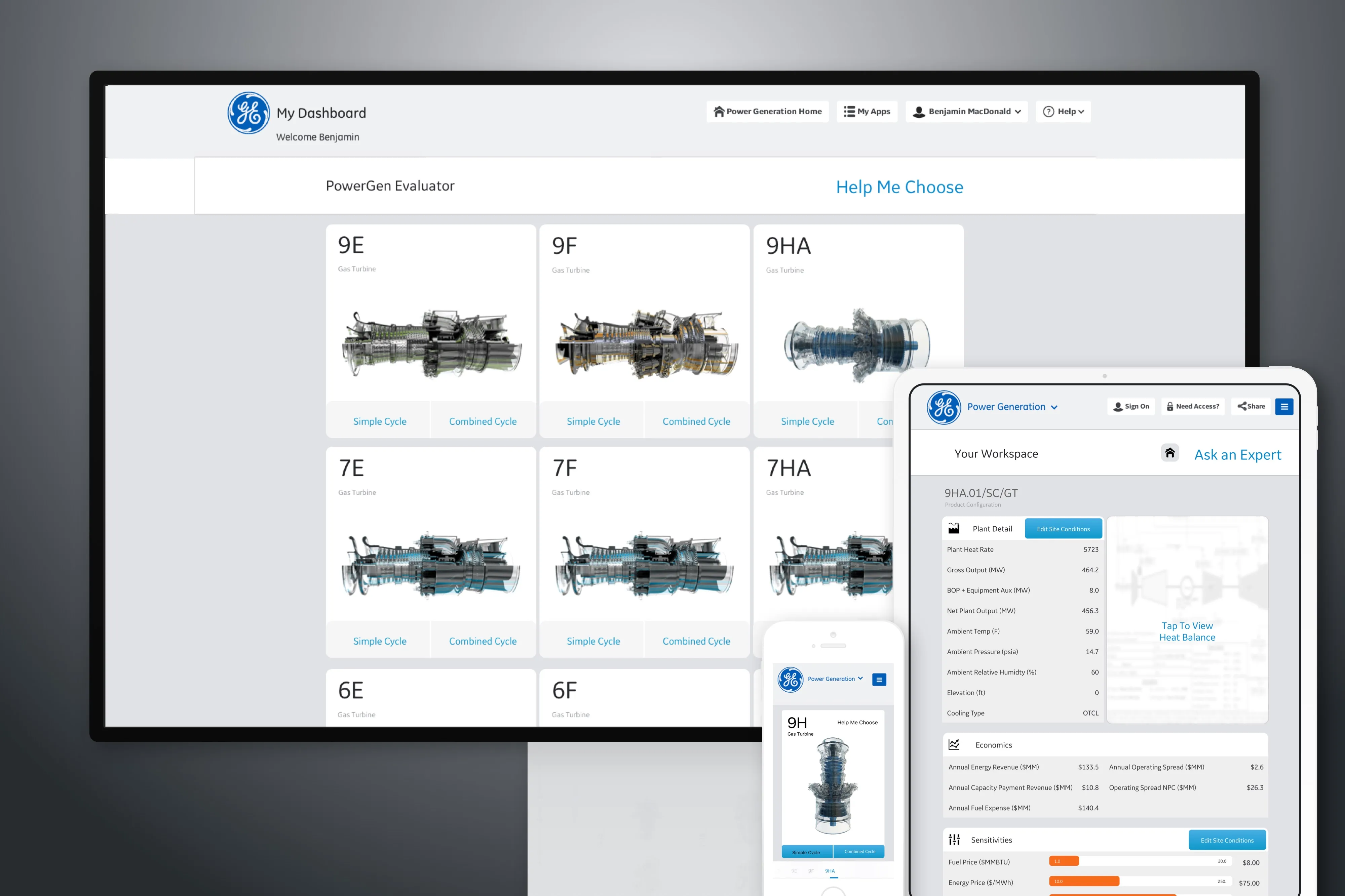


The PowerGen Evaluator was developed to modernize GE Power's turbine sales tool, transforming it from a dated, tablet-only application into a sleek, cross-platform experience. The goal was to enhance usability, streamline navigation, and present turbine data more effectively across devices. This initiative aimed to improve the sales process by providing a more intuitive and accessible tool for GE's sales representatives and customers.
The existing turbine sales application was outdated and limited to tablet use, hindering accessibility and user engagement. The challenge was to redesign the application to be modern, user-friendly, and compatible across desktop, tablet, and mobile devices, ensuring a seamless experience for users on any platform.
FACING THE CHALLENGE:
How do you transform a legacy, tablet-only application into a modern, cross-platform tool that enhances usability and effectively presents complex turbine data?


The redesigned PowerGen Evaluator received positive feedback from users, who appreciated the improved navigation structure and the application's compatibility across multiple devices. The integration of the tool into GE's existing Power Generation Portal provided a unified experience, enhancing productivity and streamlining the sales process.

